 INCISOR®
1 · Start here: TextBox and TextAssembly
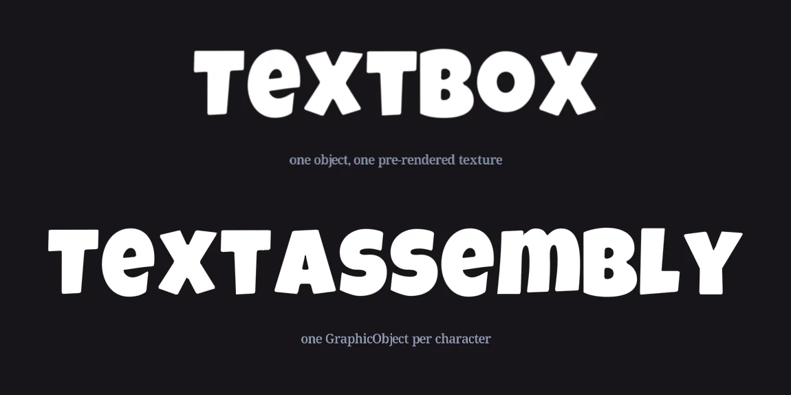
Incisor® has two text objects. They share the same layout properties, the same TextFormat, the same fonts, and the same string, so almost everything in this article applies to both. They differ in what they are made of.
TextBox
Lays its characters out, renders them once into its own texture, and shows that texture as a single GraphicObject. One object in the hierarchy, one draw. Use it for almost everything: labels, meters, paragraphs, buttons.
TextAssembly
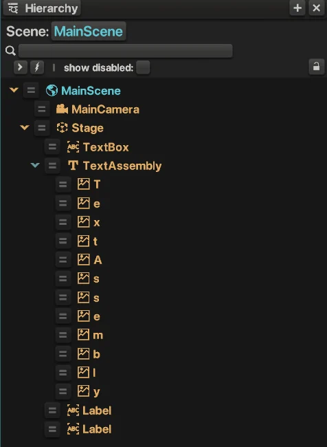
Lays its characters out as separate GraphicObjects, one per character, all children of the assembly. More objects, but every letter can be moved, scaled, rotated and tinted on its own. Use it when the characters themselves animate.
let title = new TextBox(nc.mainScene, "Title");
title.string = "Spin to Win";

let banner = new TextAssembly(nc.mainScene, "Banner");
banner.string = "BIG WIN";
Both constructors take an optional parent and name, and string is the text shown. Change string whenever you like; the text lays itself out again on the next update. In the GUI, both kinds appear in the Hierarchy panel, and a selected one shows its settings under Text Info in the Object panel.
A TextAssembly manages its own characters
getCharacters() returns the assembly's character GraphicObjects, and you can do anything to them that you can do to any GraphicObject. But the assembly owns them: the next time it lays itself out, because the string, the format or the box changed, it puts them back. So changes made directly to characters don't stick. Two things do:
- Dynamic effects that run every frame or on a trigger, such as the wave in section 12, which re-applies itself after any layout.
- Copying the characters out into your own objects when you need a permanent arrangement, for example a logo built from letters you then place by hand.
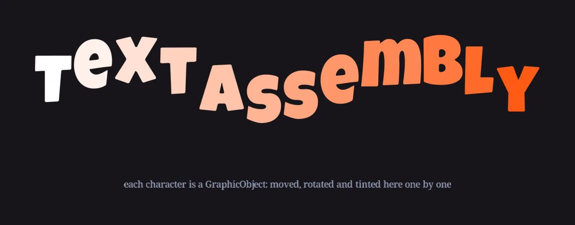
getCharacters(). It lasts until the assembly lays out again.2 · Layout: the box, wrapping, scaling, justification and pivot
Text lays out inside a box. The box has a width and a height, and either can be 0, which means no limit in that direction. You can set just one: a fixed width with a free height is the usual choice for a paragraph, and a fixed height with a free width is the usual choice for a one-line label that must never grow taller.
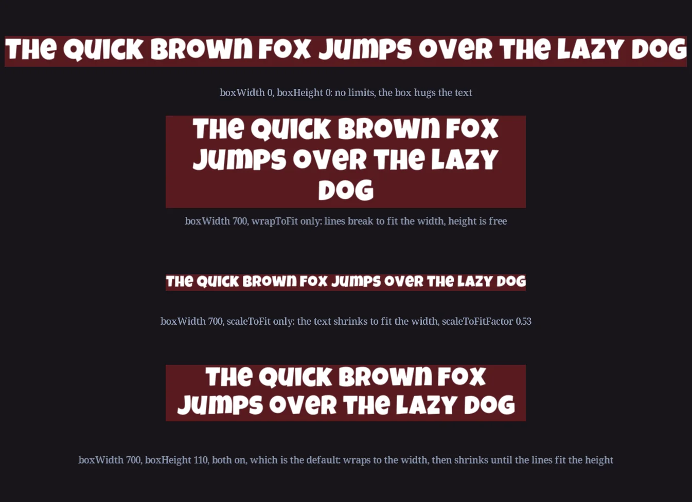
wrapToFit breaks lines to the width; scaleToFit shrinks the text to the width, and to the height when there is one.| Property | Does | Default |
|---|---|---|
boxWidth, boxHeight | The area the text is confined to. 0 means no limit in that direction. | 0, 0 |
wrapToFit | Breaks lines so the text fits the width. | true |
scaleToFit | Scales the text down until it fits the width and the height. Never scales up. | true |
scaleToFitFactor | Read-only: the factor scaleToFit applied, 1 when nothing had to shrink. | 1 |
horizontalJustification | left, center or right. Only matters when the box is wider than the text. setHorizontalJustification sets it for a range of characters. | left |
verticalJustification | top, center or bottom. Only matters when the box is taller than the text. | top |
pivotPoint | Where the object's position sits on the box, from −0.5 to 0.5 on each axis. (0, 0) is the center, (−0.5, 0.5) the left-top corner. | 0, 0 |
baselinePosition | Where the baseline sits within each line, 0 at the bottom and 1 at the top. See section 3. | 0.22 |
textWidth, textHeight | Read-only: the size of the laid-out text. |
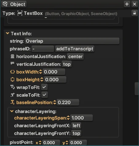
phraseID and renderResolutionScaler alongside them.Both fit modes are on by default. With a width only, the text wraps and never needs to shrink. Add a height and the text wraps first, then shrinks until the wrapped lines fit. Turn wrapToFit off when a label must stay on one line and shrink instead.
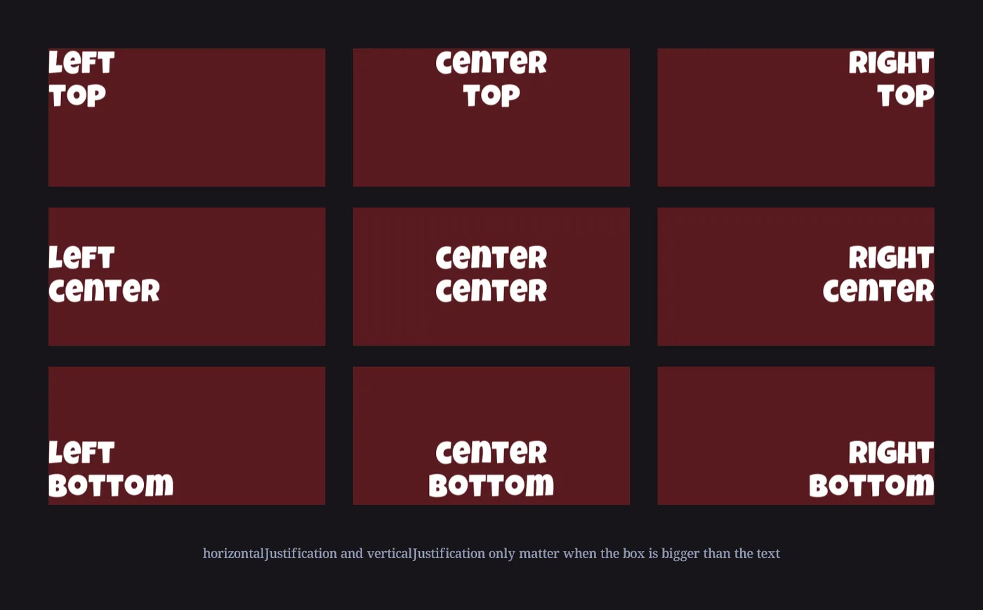
Pivot and justification are different things
Justification moves the text inside the box. The pivot moves the box around the object's position. A right-justified label with a right-top pivot stays glued to a corner of the screen however long its text gets.
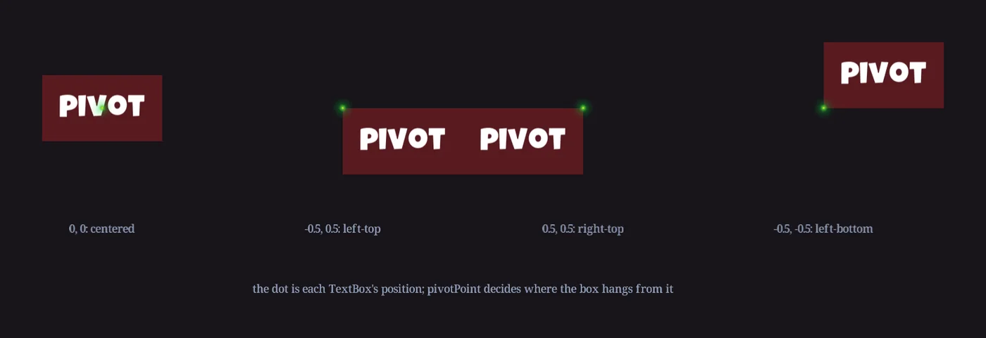
pivotPoint decides where the box hangs from it.Set the pivot by dragging. In the Live View and Construct panels, select a TextBox, then hold Alt while you drag its gizmo: the pivot moves instead of the text, and pivotPoint updates to match. The same gesture on a GraphicObject adds a PivotPointAdjuster instead, since only text objects have a pivotPoint of their own.
let balance = new TextBox(nc.mainScene, "Balance");
balance.boxWidth = 400;                 // one line, never taller
balance.wrapToFit = false;              // shrink instead of wrapping if it ever gets too long
balance.horizontalJustification = "right";
balance.pivotPoint.x = 0.5;             // hang from the right-top corner
balance.pivotPoint.y = 0.5;
balance.position.x = 780;
balance.position.y = 430;
balance.string = "$1,000.00";
Two TextBox-only properties round out the box. isTrimmed shrinks the texture to the drawn text instead of the full box, which saves texture memory on a big, mostly empty box. The four bleed values (leftBleed, rightBleed, topBleed, bottomBleed) add texture past the box's edges without moving the text; section 6 shows why you'd want that.
When characters overlap: character layering
Tight kerning, a script font, or lines squeezed together with lineHeightMultiplier make characters overlap, and then which one is drawn on top matters. Character layering settles it: characterLayeringSpan spreads a subLayer range evenly across the characters, so overlapping characters stack in a set order instead of whichever happens to draw last.
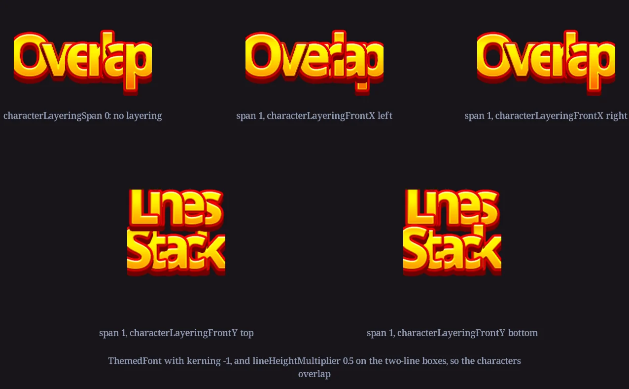
characterLayeringFrontX left and right. Bottom: two overlapping lines with characterLayeringFrontY top and bottom.| Property | Does | Default |
|---|---|---|
characterLayeringSpan | The total subLayer range, 0 to 2, spread evenly across the visible characters. 0 turns layering off. | 0 |
characterLayeringFrontX | Which side's characters are in front within a line: left or right, from nc.constants.horizontalSides. | left |
characterLayeringFrontY | Which side's lines are in front: top or bottom, from nc.constants.verticalSides. | top |
title.textFormat.kerning = -0.55;                                   // letters overlap
title.characterLayeringSpan = 1;                                    // stack them in a set order
title.characterLayeringFrontX = nc.constants.horizontalSides.left;  // each letter over the one to its right
title.characterLayeringFrontY = nc.constants.verticalSides.top;     // upper lines over lower lines
Lines are ordered first, then the characters within each line, so with the defaults the top line's leftmost character is frontmost of all. In a TextAssembly the span becomes real subLayer values on the character objects, centered on 0; in a TextBox the ordering happens inside its own texture and leaves the scene's layering alone. Both kinds save the settings with Constructs, and the fields sit in the characterLayering group of Text Info.
3 · Fonts: font files, graphic fonts and font definitions
A font is anything in the Assets folder that Incisor® can turn into one image per character. There are two ways to give it one.
A font file: .ttf or .otf
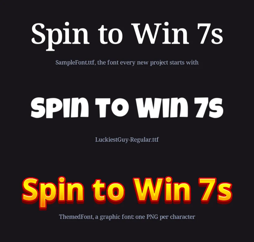
Drop the file into Assets. Incisor® draws each character it needs into an image at five times its size, shapifies it (section 7), packs the characters onto a sprite sheet, and names the font after the file. Every new project starts with SampleFont.ttf.
A graphic font: one PNG per character
Draw the characters yourself, as PNGs named FontName_Char<code>, where the code is the character's Unicode number: ThemedFont_Char65.png is A, ThemedFont_Char48.png is 0. Keep them together in a folder.
Char0 is the key
A graphic font must include FontName_Char0.png. Incisor® finds fonts by looking for that file: every _Char0 it sees in Assets becomes a font with that name. The image itself is the null character, drawn for any character the font has no image for, so a plain rectangle makes missing characters obvious. It also sets two measurements for the whole font: its width becomes the font's characterWidth and its height the font's lineHeight.
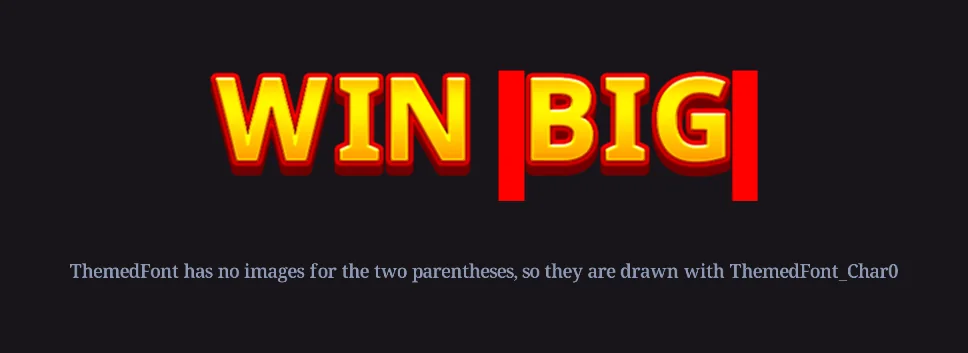
- The space is a character too. Its width is the width of
_Char32.png. With no Char32, the space falls back to Char0, so give it its own image, usually a transparent one of the width you want. - Graphic fonts come in as ordinary images, not shapified, at one unit per pixel. Their image settings are per PNG, or set once on the folder.
- Several files can share one font. A font file's fontFamily setting in the Assets panel lets several files carry the characters of one font between them.
- Font names are in code at
nc.fontNames, sonc.fontNames.ThemedFontautocompletes and misspellings are caught.
Font definitions in Project Settings
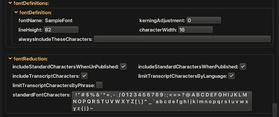
lineHeight and characterWidth matter more than they look, because many formatting values are expressed in terms of them:
| Setting | Comes from | Used for |
|---|---|---|
lineHeight | The font file's line height, or the height of Char0 for a graphic font | The height of a line of this font in units. verticalShift and lineHeightMultiplier are multiples of it. |
characterWidth | The width of Char0 | The font's unit of horizontal spacing. kerning and kerningAdjustment are multiples of it. |
kerningAdjustment | 0 | Extra spacing added to every character of this font, in multiples of characterWidth. A quick fix for a font that comes out too tight or too loose. |
alwaysIncludeTheseCharacters | empty | Characters font reduction must never drop from this font (section 4). |
Both measurements can be changed, in Project Settings or at runtime through nc.projectConfiguration.fontDefinitions.ThemedFont.lineHeight, and everything expressed in their terms follows.
Graphic fonts: center the baseline
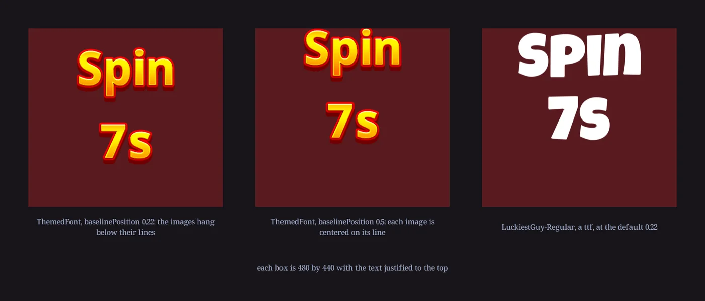
A font file carries its baseline, so Incisor® draws each glyph with the right amount hanging below the line, and the default baselinePosition of 0.22 looks right. A graphic font has no such information: each character image is simply placed with its center on the baseline. With the baseline 22% up the line, the images sit low and spill below their lines. Set baselinePosition to 0.5 for a graphic font, so each image is centered on its line, and draw every character on the same-size canvas with the artwork where you want it.
4 · Font reduction: which characters a font carries
A font file has thousands of glyphs. Shipping them all as images would be a big download, so Incisor® only turns the characters a project needs into images. That is font reduction, and when it guesses wrong you see the symptom from section 3: characters drawn as Char0 rectangles, or as bars, usually only after publishing, and often only in one language.
The console tells you. When text asks for a character its font doesn't carry, Incisor® logs: Some of the requested character graphics for the 'ThemedFont' font could not be found in the project assets. Missing Characters: (,) Review the 'fontReduction' and 'fontDefinition' configurations in the ProjectSettings.
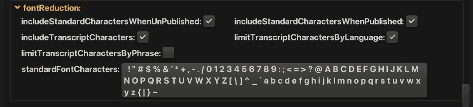
A font's character set is the union of these sources:
| Setting | Adds | Default |
|---|---|---|
standardFontCharacters | A list of character codes given to every font: by default the printable ASCII set, space through tilde. | ASCII |
includeStandardCharactersWhenUnPublished | Whether that list is included while developing. | on |
includeStandardCharactersWhenPublished | Whether that list is included in a published build. Turn it off for the smallest download, once the transcript covers everything. | on |
includeTranscriptCharacters | Every character used by a phrase in the ProjectTranscript. | on |
limitTranscriptCharactersByLanguage | Only the characters of the language being published, so a Spanish build doesn't carry Thai glyphs. | on |
limitTranscriptCharactersByPhrase | Only the phrases paired with each font, so a title font doesn't carry the paytable's characters. | off |
alwaysIncludeTheseCharacters | Per font, in its definition: characters or codes that are always included, whatever the language. | empty |
Pairing phrases with fonts
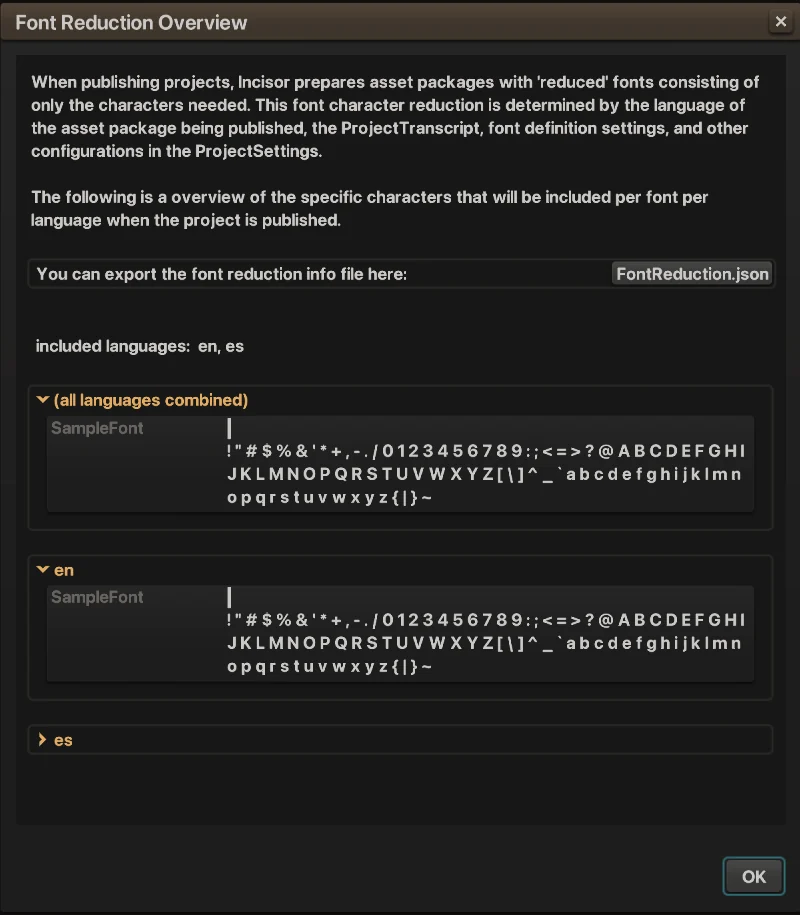
The transcript knows which phrases exist, but not which font each one is drawn in. The Transcript panel's include in fonts checkboxes record that pairing per phrase (it is stored as phrasesUsingThisFont in each font definition), and Detect Pairings… scans your Constructs for text objects that use a phraseID and lists any pairs you haven't recorded yet. Font Reduction… in the same panel opens an overview of exactly which characters each font will carry.
When characters go missing
- Text set from code, not from the transcript, only has the standard set to rely on. Add its characters to
alwaysIncludeTheseCharacters, or put the text in the transcript. - Numbers formatted with currency symbols or thin spaces need those characters included too.
- A graphic font can only ever draw the images it has. Draw a Char0 that stands out, so a gap is obvious during development.
- A font that only shows capitals and digits in a published build is one whose other characters were reduced away. Check the Font Reduction overview for the language you published.
5 · TextFormats: font, size, spacing and ranges
A TextFormat says how characters look: which font, how big, how far apart. Every text object has one at textFormat that covers the whole string, and you can apply other formats to ranges of characters.
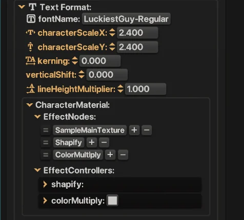
| Property | Does | Measured in |
|---|---|---|
fontName | The font, by name. Changing it resets characterMaterial to the new font's presets. | |
characterScaleX, characterScaleY | The size of the characters. This is how you make text bigger (see section 8 for why not to scale the object). | multiplier, 1 is the font's native size |
kerning | Space added between characters, or removed when negative. When negative kerning makes letters overlap, character layering (section 2) decides which is on top. | multiples of the font's characterWidth |
verticalShift | Moves the characters up or down. | multiples of the font's lineHeight |
lineHeightMultiplier | Stretches or squeezes the distance between lines. | multiplier of the font's lineHeight |
characterMaterial | The EffectNodes and EffectController values the characters are drawn with: color, gradients, strokes. Section 6. |
Kerning and vertical shift scale with the format's character scale, so a format keeps its look at any size.
Formats on a range: rich text
setTextFormat(format, startIndex, numChars) applies a format to part of the string, and nothing stops the parts from using different fonts. clone() gives you a copy of the current format to vary, and copy(source) writes one format's values into another in place.
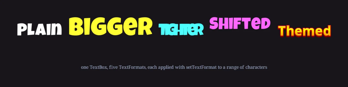
let text = new TextBox(nc.mainScene, "Formats");
text.string = "Plain  Bigger  Tighter  Shifted  Themed";
text.textFormat.fontName = nc.fontNames["LuckiestGuy-Regular"];
text.textFormat.characterScaleX = 1.2;
text.textFormat.characterScaleY = 1.2;

let bigger = text.textFormat.clone();
bigger.characterScaleX = bigger.characterScaleY = 1.8;
bigger.characterMaterial.colorMultiply.blue = 0.2;
text.setTextFormat(bigger, 7, 6);            // "Bigger"

let tighter = text.textFormat.clone();
tighter.kerning = -0.9;
text.setTextFormat(tighter, 15, 7);          // "Tighter"

let shifted = text.textFormat.clone();
shifted.verticalShift = 0.35;
text.setTextFormat(shifted, 24, 7);          // "Shifted"

let themed = text.textFormat.clone();
themed.fontName = nc.fontNames.ThemedFont;   // a different font, mid-line
themed.characterScaleX = themed.characterScaleY = 0.14;
text.setTextFormat(themed, 33, 6);           // "Themed"
Share formats. A TextFormat is a plain object. Make one per style your game uses, keep them on pr, and assign the same one to every text object of that style. Edit it in one place and every text object using it follows.
6 · Styling characters: color, gradient, italic, stroke
How characters are drawn is decided by the format's characterMaterial. It works like any other Material: a list of EffectNodes, each with EffectControllers you set values on. The presets come from the font's Char0, which is why changing fontName resets it.
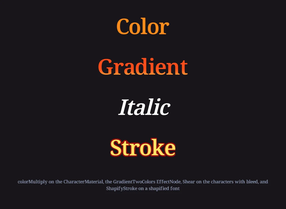
colorMultiply, a two-color gradient, a shear and a stroke, all set on the CharacterMaterial of each TextBox.// Color: the ColorMultiply EffectNode is already there
let material = title.textFormat.characterMaterial;
material.colorMultiply.red = 1;
material.colorMultiply.green = 0.55;
material.colorMultiply.blue = 0.1;
// Gradient: add the GradientTwoColors EffectNode from the Template Library to the list
material.setEffectNodes([
nc.effectNodes.SampleMainTexture, nc.effectNodes.Shapify,
nc.effectNodes.GradientTwoColors, nc.effectNodes.ColorMultiply
]);
material.gradientTwoColors.angle = 90;
material.gradientTwoColors.scale = 40;
let top = material.gradientTwoColors_color0, bottom = material.gradientTwoColors_color1;
top.red = 1; top.green = 0.9; top.blue = 0.3;
bottom.red = 1; bottom.green = 0.3; bottom.blue = 0.1;
// Stroke: ShapifyStroke replaces Shapify on a shapified font (section 7)
material.setEffectNodes([
nc.effectNodes.SampleMainTexture, nc.effectNodes.ShapifyStroke, nc.effectNodes.ColorMultiply
]);
material.shapifyStroke.strokeThickness = 4;
material.shapifyStroke.edgeFeather = 0.6;
let fill = material.shapifyStroke_innerColor, outline = material.shapifyStroke_outerColor;
fill.red = 1; fill.green = 0.9; fill.blue = 0.4;
outline.red = 0.6; outline.green = 0.05; outline.blue = 0.05;The Template Library tab of the inspector has the EffectNodes used here: GradientTwoColors, GradientThreeColors and GradientFourColors, ShapifyStroke, and Shear. Add one to your project and it appears at nc.effectNodes with its controllers.
Italic is a shear, and a TextBox needs bleed for it
There is no italic switch. Lean the characters with the Shear EffectNode instead: add it to the CharacterMaterial's node list and set shear.yAngle. Each character's geometry tips over on its own, so the letters lean the way italics do while their spacing stays put. One catch in a TextBox: the texture is exactly the size of the box, so the parts of the first and last letters that now lean past the edge get cut off. leftBleed and rightBleed add texture past the edges to make room.
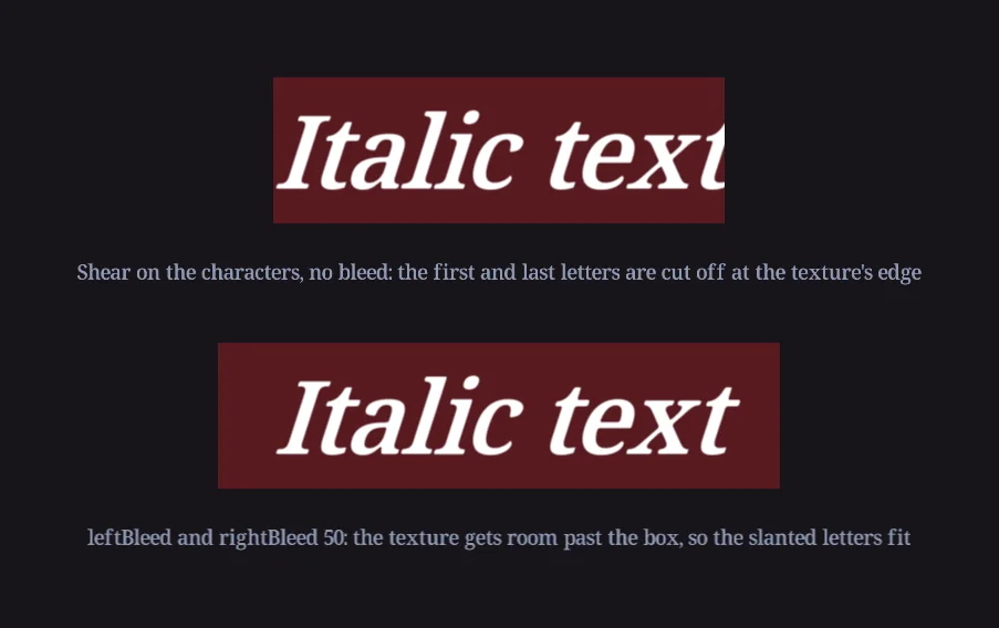
let material = title.textFormat.characterMaterial;
material.setEffectNodes([
    nc.effectNodes.SampleMainTexture, nc.effectNodes.Shapify, nc.effectNodes.Shear, nc.effectNodes.ColorMultiply
]);
material.shear.yAngle = -14;
title.leftBleed = title.rightBleed = 40;   // room for the leaning first and last letters
Bold is a different story, told in the next section.
7 · Shapify and bold
Shapify is an import setting for any image, and it matters most for fonts: every .ttf and .otf you drop into Assets is shapified unless you turn it off. Instead of storing the picture of each character, Incisor® stores a signed distance field: for every pixel, how far it is from the character's edge. The Shapify EffectNode rebuilds the edge from that as the character is drawn, at whatever size it is drawn, so the edge stays crisp when the text is big, and the stored image can be much smaller than the text it produces.
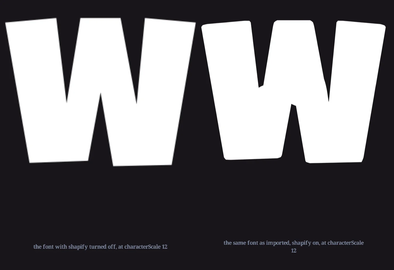
characterScale 12, with shapify turned off and as it comes in, shapified. Both store the glyph at the same resolution.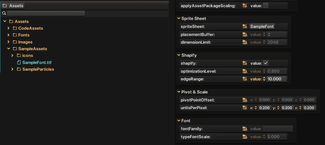
| Assets panel setting | Does |
|---|---|
shapify | Stores the image as a distance field and puts the Shapify EffectNode on every instance, so the edge is rebuilt as it is drawn. |
optimizationLevel | How far the stored image's resolution is cut back, since the node rebuilds the edge rather than reading it. 0 keeps the authored resolution; 1 takes it all the way down. A smaller download for a slightly less exact edge. |
edgeRange | The furthest distance from the edge, in pixels, that the field describes. It is also the furthest the edge can be pushed outward, so it caps how bold a character can be made and how thick a stroke can be. |
typeFontScale | For font files: the scale each character is drawn at when the file is turned into images. Higher is crisper at large sizes and costs more download. It has nothing to do with the size text is drawn at. |
Bold
Because the edge is rebuilt from distances, it can be moved. ShapifyStroke from the Template Library adds edgeOffset, which pushes the edge outward to make characters heavier, or inward to make them lighter, plus edgeFeather for softness and strokeThickness for an outline in a second color. One font file gives you regular, bold and outlined text, within the edgeRange you imported it with.
let bold = title.textFormat.clone();
bold.characterMaterial.setEffectNodes([
    nc.effectNodes.SampleMainTexture, nc.effectNodes.ShapifyStroke, nc.effectNodes.ColorMultiply
]);
bold.characterMaterial.shapifyStroke.edgeOffset = 2;      // pixels of the stored image, up to edgeRange
title.setTextFormat(bold, 0, 4);                           // embolden the first word
Graphic fonts can be shapified too, as long as the artwork is a solid shape. A gradient-filled, multi-colored font like ThemedFont can't be reduced to one edge, so leave shapify off for those and give them enough pixels instead.
8 · Sharp text: character scale, object scale and resolution
A TextBox is rendered twice: once into its own texture, and then that texture is drawn in the scene. Anything that stretches the texture blurs it. The rule that follows is simple: size text with the format, not the object.
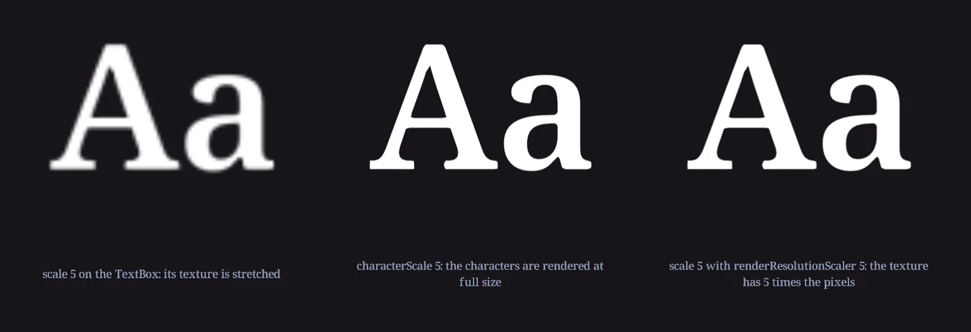
characterScale 5, rendered at full size. Right: object scale 5 with renderResolutionScaler 5.| To get | Do |
|---|---|
| Big text | Raise characterScaleX and characterScaleY on the format. The texture is rendered at the size the text is shown. |
| Text that animates in size | Scaling the object is fine for a quick pop, since it is cheaper than laying out again every frame. Set renderResolutionScaler on the TextBox to the largest scale the animation reaches, and the texture has the pixels to survive it. |
| Small UI text that looks soft | Set useNearestPixelRendering, when one unit is one pixel. See below. |
| Crisp edges at any size from one small font | Shapify the font (section 7). |
useNearestPixelRendering
The second render is the problem: when the texture's pixels don't line up with the canvas's, small text gets resampled and loses its edges. useNearestPixelRendering switches the TextBox's texture to nearest-neighbour sampling and snaps its position to whole pixels, so texture pixels and canvas pixels coincide and the edges come through untouched. It only helps when a texture pixel is a canvas pixel, so it's for projects, or cameras, set up with one unit per pixel, such as the inspector itself. The price is that the text snaps as it moves, so slow movement looks steppy and rotation tears. For text that moves, a TextAssembly avoids the second render altogether.
renderResolutionScaler is a multiplier on the resolution a TextBox renders its texture at. The texture of the right-hand "Aa" above has five times the pixels in each direction, so the object can be scaled by five with no loss. It costs texture memory, so use it where the scale is actually needed.
9 · Images in text: substitution characters
To put a symbol, an icon or a coin inside a line of text, pick a character to stand for it and give it a GraphicAsset with setSubstitutionCharacter. Every occurrence of that character is drawn as the image and takes the image's width in the layout. An optional TextFormat positions and sizes it: the image's height comes from the image, so characterScale sizes it, verticalShift seats it on the line, and kerning gives it breathing room.
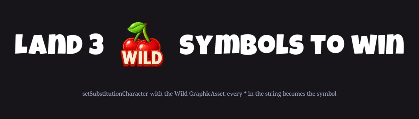
let text = new TextBox(nc.mainScene, "Hint");
text.string = "Land 3 * symbols to win";

let imageFormat = new TextFormat();
imageFormat.characterScaleX = imageFormat.characterScaleY = 0.5;
imageFormat.verticalShift = 0.8;        // lift the image so it sits on the line
imageFormat.kerning = 0.5;
imageFormat.characterMaterial.setEffectNodes([
    nc.effectNodes.SampleMainTexture, nc.effectNodes.ColorMultiply
]);

text.setSubstitutionCharacter("*", nc.graphicAssets.Wild, imageFormat);
Give the image its own material. The format's CharacterMaterial starts from the font's presets, which for a shapified font include the Shapify node. A photo-like image needs plain nodes, as above, or it will be drawn as a silhouette.
Choose a character you won't otherwise need in that text object. Substitutions are per object, so * can be a cherry in one TextBox and an ordinary asterisk in another. When the pieces need to stay separate objects, for example because the image animates, a LayoutStack holding a TextBox, a GraphicObject and another TextBox is the alternative.
10 · Meters and monospacing
In most fonts a 1 is narrower than an 8. A meter that rolls from 1,111 to 8,888 therefore changes width every frame, and centered text visibly breathes. The fix in Incisor® is direct: character widths come from the character images, so make the digits the same width.
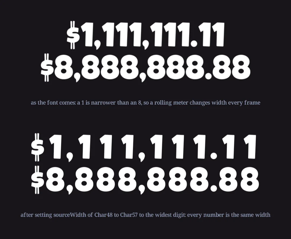
A character's advance is its GraphicAsset's geometry.sourceWidth plus the kerning, and the asset is reachable by name: the font's name, _Char, and the character code. Digits are codes 48 to 57. Set the widths once at startup and every text object using that font lays out monospaced digits from then on. The glyph keeps its own shape, centered in the wider slot.
// find the widest digit of the meter font, then give all ten digits that width
let widest = 0;
for (let code = 48; code <= 57; code++)
{
    widest = Math.max(widest, nc.graphicAssets["MeterFont_Char" + code].geometry.sourceWidth);
}
for (let code = 48; code <= 57; code++)
{
    nc.graphicAssets["MeterFont_Char" + code].geometry.sourceWidth = widest;
}- Only the digits. Leave the comma and the point narrow, or the number looks gappy. If the punctuation also needs to stay put, give it a width too.
- One font per job. The change applies to every text object using that font, so if the body copy shares the meter's font, add the font file a second time under another name and monospace that one.
- Fix the box as well. A meter in a
boxWidththat fits its largest value, withwrapToFitoff, can't push its neighbours around however it is justified. - Rolling up is just setting
stringeach frame.nc.swoopValueon a number and a formatter in the callback is all a roll-up takes.
11 · Transcript and phraseIDs
Text a player reads belongs in the ProjectTranscript, the project's table of phrases in every language it supports. A text object then takes a phraseID instead of a string, and shows that phrase in the language the project is running in. The transcript is also what font reduction reads to decide which characters each language needs.
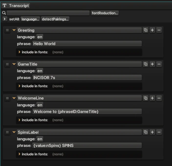
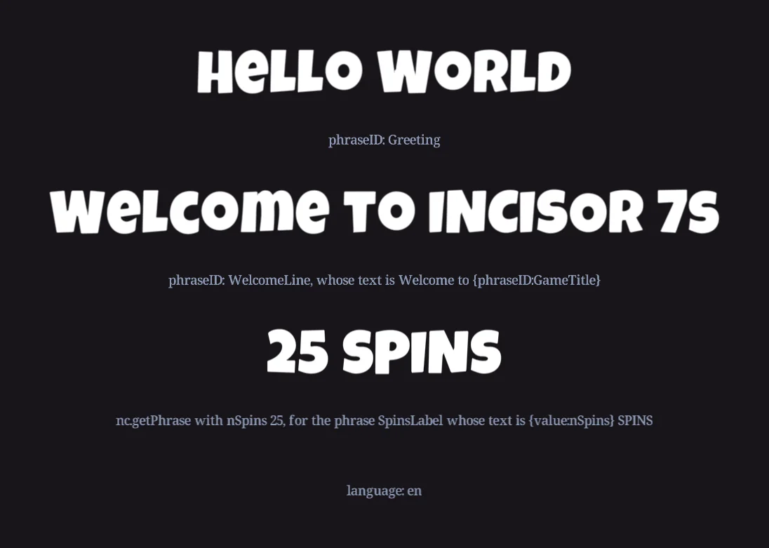
// a phraseID instead of a string: the text follows the project's language
title.phraseID = nc.phraseIDs.Greeting;

// a phrase with a dynamic value tag, "{value:nSpins} SPINS" in the transcript
spins.string = nc.getPhrase(nc.phraseIDs.SpinsLabel, { nSpins: 25 });

// nc.phrases holds the plain phrases in the current language
console.log(nc.phrases.Greeting);| In a phrase | Means |
|---|---|
{value:nSpins} | A dynamic value, filled in by nc.getPhrase(phraseID, { nSpins: 25 }). The translation decides where the number goes. |
{phraseID:GameTitle} | Another phrase, inserted here. Name the game once and reference it everywhere. A referenced phrase must not need dynamic values of its own. |
- Add to transcript next to the phraseID field in the Object panel turns a text object's current string into a new phrase and links the object to it, which is the quickest way to move hard-coded text into the transcript.
- Languages are an asset configuration. The ones a project supports are listed in Project Settings, and the one it runs in is chosen in
PreloadConfigurationcode before anything loads, so a language switch is a reload with a differentassetConfiguration.language. - Pair phrases with fonts using include in fonts in the Transcript panel, so font reduction can give each font only the characters its phrases use (section 4).
- phraseIDs are in code at
nc.phraseIDs, so they autocomplete, and a renamed phrase shows up as an error instead of a blank label.
12 · Animating characters
Animating a whole text object is ordinary SceneObject animation: swoop its scale, tween its position, keyframe it on a Construct Timeline. Animating the characters is what TextAssembly is for.
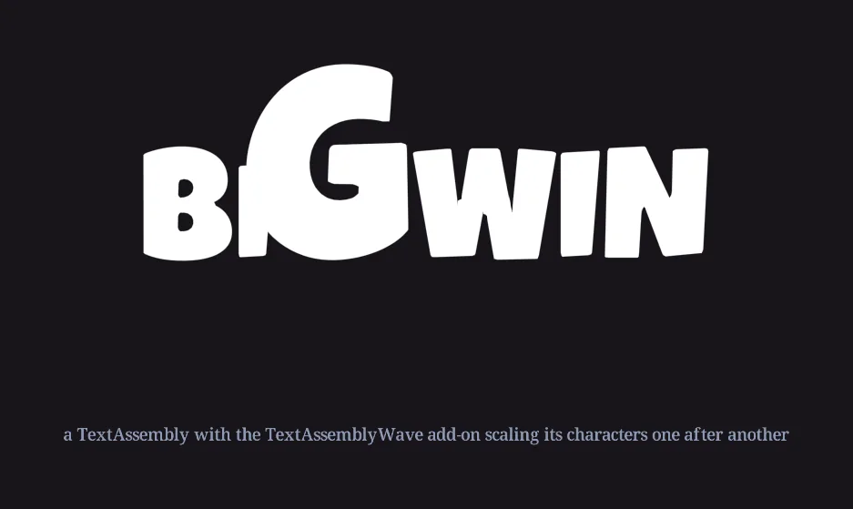
TextAssemblyWaveExample add-on, caught mid-wave.let banner = new TextAssembly(nc.mainScene, "Banner");
banner.string = "BIG WIN";
banner.textFormat.characterScaleX = banner.textFormat.characterScaleY = 3;
// from the Template Library: Custom AddOns → TextAssembly → TextAssemblyWaveExample
let wave = new TextAssemblyWaveExample(banner);
wave.overscaleMultiplier = 1.7;
wave.totalStaggerTime = 1.6;
wave.doTheWave();The add-on is a short class worth reading: it calls getCharacters(), then swoops each character's scale with a growing delay. The same pattern, a loop over getCharacters() with a per-character delay, gives you drop-ins, fades, color sweeps and shakes. Run the effect from a trigger or every frame rather than once, since the assembly re-lays its characters out whenever its text or format changes (section 1).
Bending a TextBox
A TextBox can't animate its characters, but as a single textured quad it can be bent. Vertex-deforming EffectNodes such as Arch and Bulge from the Template Library need vertices to move, so raise numHorizontalGridSegments and numVerticalGridSegments on the TextBox to subdivide its geometry before applying them. A straight shear needs no subdivision.
13 · Housekeeping: performance, updates and callbacks
- Prefer TextBox. Fewer objects in the scene is faster, and a TextBox is one object however long its string. Use TextAssembly only where characters animate individually.
- Don't lay out every frame. Changing
string, the format, or the box requires the TextBox or TextAssembly to calculate a new layout, and a TextBox then renders itself again as well. These costs build up: a meter that changes every frame is fine, a paragraph that changes every frame may contribute to performance issues. - Layout is lazy. It happens on the next update after a change, which is why a freshly set TextBox reports
textWidth0 until then. To read sizes immediately, setlayoutLazyUpdater.needsUpdate = trueand calllayoutLazyUpdater.updateIfNeeded(). - Free the pools. Text objects pool their characters internally, and a very long string leaves a large pool behind.
clearPools()releases it, at the cost of a one-time hit the next time a long string is shown. - Watch the string.
addStringUpdateCallback(owner, "callbackName")fires whenever the string changes, with the new string as its first argument. - Fonts and loading tiers. A TextBox renders as soon as the GraphicAssets of its characters are loaded; its
loadingTierRequirementsdefaults to the tier of its first character's asset. Keep a font in the tier of the first screen that uses it. - Publishing. Font reduction (section 4) and shapify's
optimizationLevel(section 7) are the two levers on download size. Check the Font Reduction overview for each language before a release.
14 · Cheat sheet
| I want to | Use | Where |
|---|---|---|
| Show a label or meter | new TextBox(), string | code |
| Animate each letter | new TextAssembly(), getCharacters() | code |
| Limit width, wrap, shrink | boxWidth, boxHeight, wrapToFit, scaleToFit | Object → Text Info |
| Align inside the box | horizontalJustification, verticalJustification | Object → Text Info |
| Anchor to a corner | pivotPoint | Object → Text Info |
| Decide which overlapping letters are on top | characterLayeringSpan, characterLayeringFrontX, characterLayeringFrontY | Object → Text Info → characterLayering |
| Add a font | Drop a .ttf/.otf, or Name_Char<code>.png files with a _Char0, into Assets | Assets folder |
| Tune a font's spacing | lineHeight, characterWidth, kerningAdjustment | Project Settings → fontDefinitions |
| Seat a graphic font | baselinePosition = 0.5 | Object → Text Info |
| Stop characters going missing | alwaysIncludeTheseCharacters, transcript, include in fonts | Project Settings → fontReduction, Transcript panel |
| Make text bigger | characterScaleX, characterScaleY | Object → Text Format |
| Space letters | kerning (× characterWidth) | Object → Text Format |
| Style part of a string | setTextFormat(format, start, count) | code |
| Color, gradient, stroke | characterMaterial + EffectNodes | Object → Text Format → CharacterMaterial |
| Italic | Shear EffectNode on the CharacterMaterial, plus bleed | Template Library |
| Bold, outline, crisp scaling | shapify + ShapifyStroke | Assets panel, Template Library |
| Keep scaled text sharp | renderResolutionScaler | code |
| Put an image in a line | setSubstitutionCharacter | code |
| Stop a meter bouncing | equal geometry.sourceWidth on the digit assets | code |
| Translate | phraseID, nc.getPhrase, {value:}, {phraseID:} | Transcript panel |